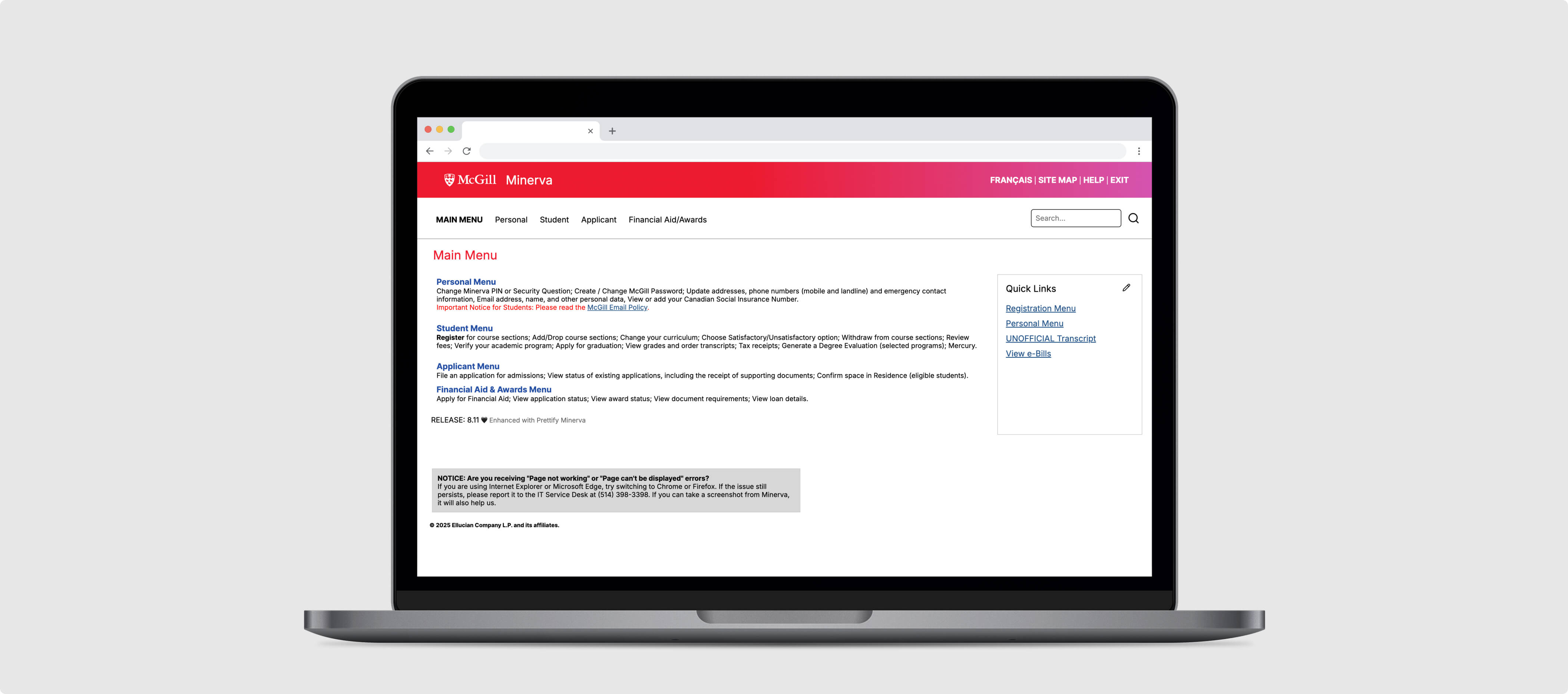
Prettify Minerva
Chrome Extension
TIME
May 2025
ROLE
Designer & Front-End Developer
TOOLS
Figma, JavaScript, HTML/CSS
OVERVIEW
Minerva is McGill University's central student information system, a web-based platform where students can access their academic information. However, its design has remained largely unchanged since 2002, resulting in a dated interface that lacks modern visual appeal and user-friendly functionality. As a McGill student, I decided to embark on a journey to modernize the platform.
THE PROBLEM
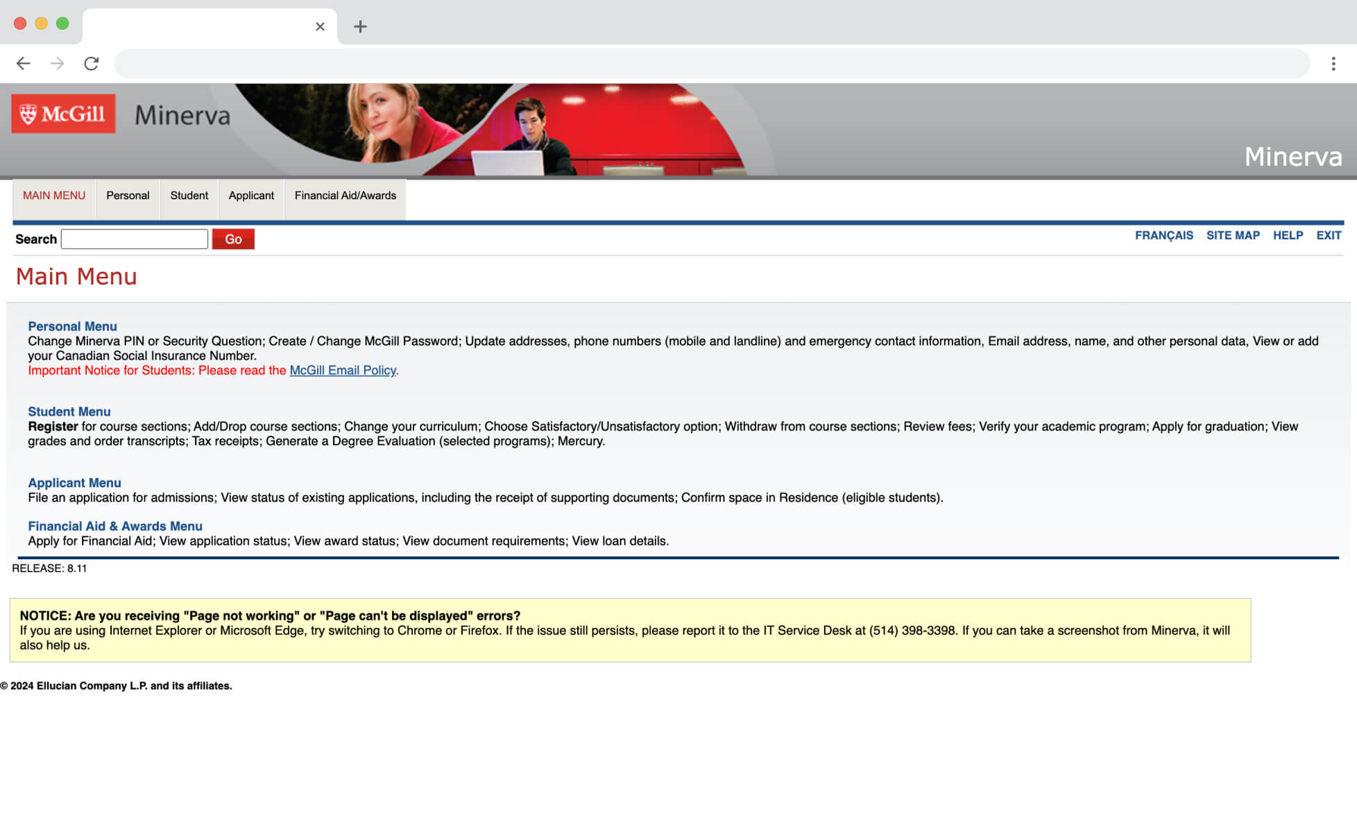
Minerva’s interface feels outdated, with dense information coupled with poor spacing, a dull aesthetic, and limited responsiveness. The small text and cluttered layout make it difficult to read and navigate, especially for first-time users. A redesign would aim to improve clarity, streamline the user experience, and make the platform more visually engaging and accessible.
INITIAL REDESIGN
I initially redesigned Minerva in December 2024 - January 2025, as a personal UX/UI project to learn Figma and explore a dashboard-style concept of Minerva.
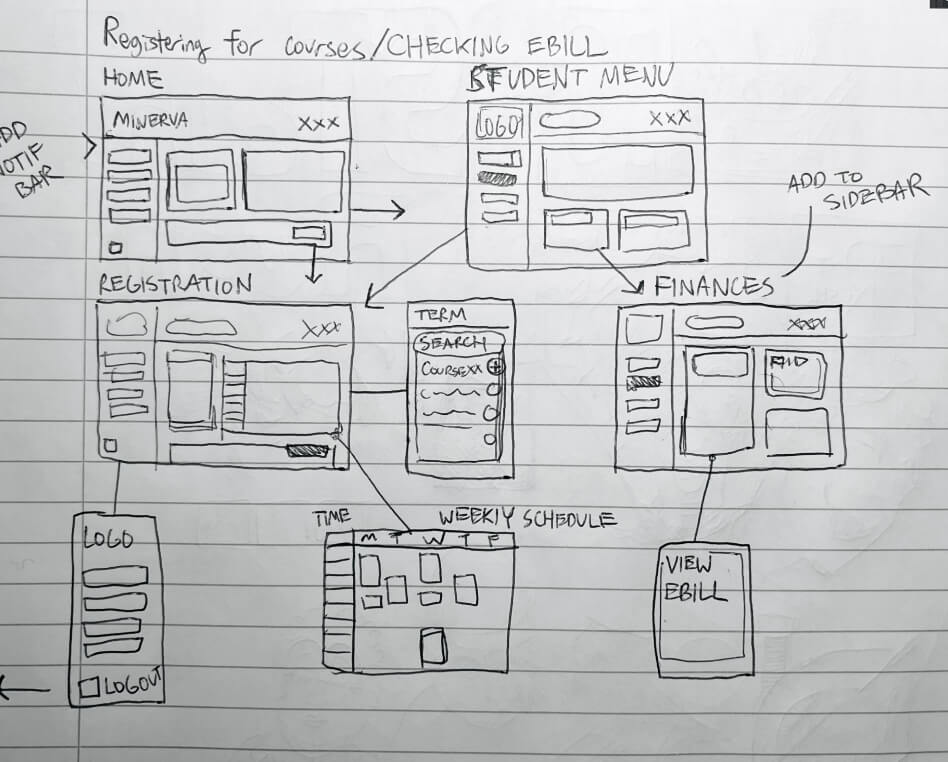
Sketch

LoFi
Figma Prototype
REDDIT RESPONSE
I shared this redesign concept of Minerva on the McGill subreddit, which garnered over 70,000 views and positive engagement from the McGill community.
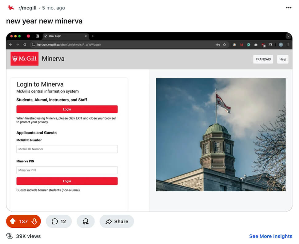
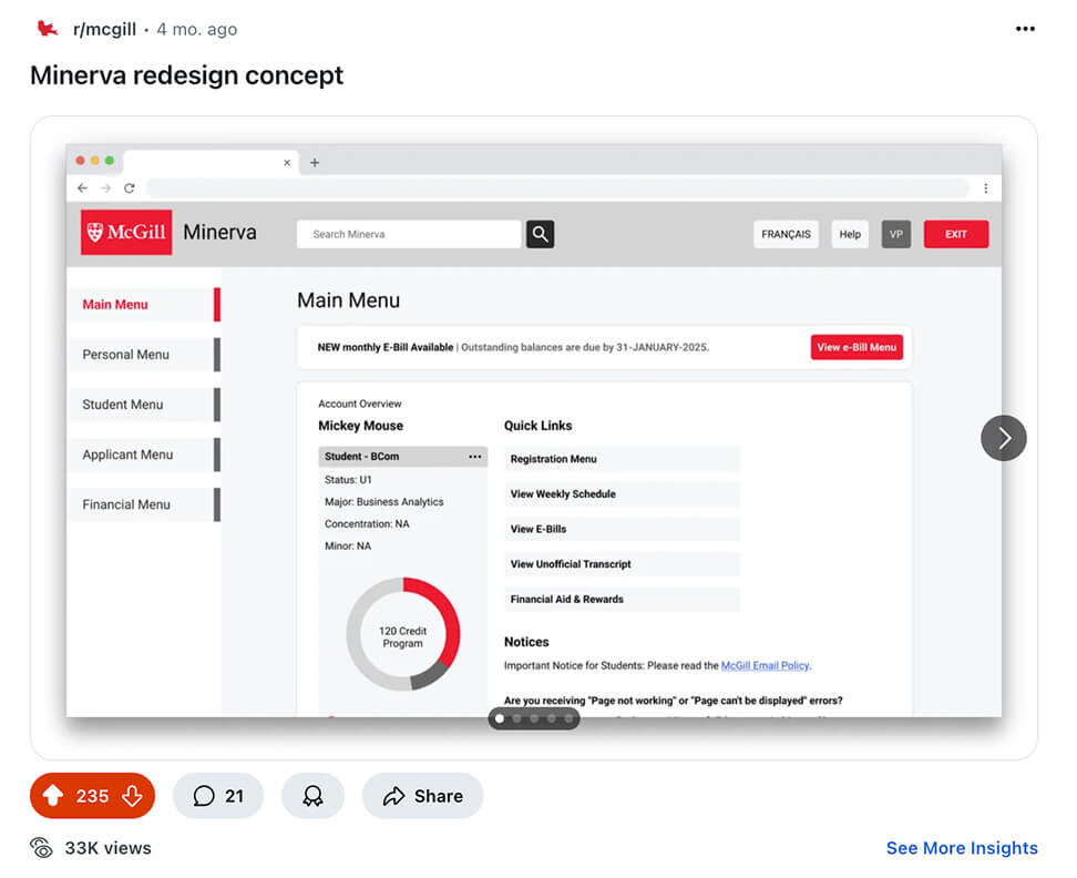
TOP COMMENT
One of the top upvoted comments suggested a Chrome extension to change Minerva’s appearance. I didn’t have much coding experience at the time, but the idea stuck with me. In May, I revisited it and built it into a real working browser extension.
CHROME EXTENSION
I first followed this youtube tutorial to get started:
How To Inject JavaScript And CSS Into Any Website - Build A Chrome Extension From Scratch
As I learned more about Chrome extensions and their capabilities, I made a goal to develop an extension which would change the layout and CSS styling of Minerva’s pages.
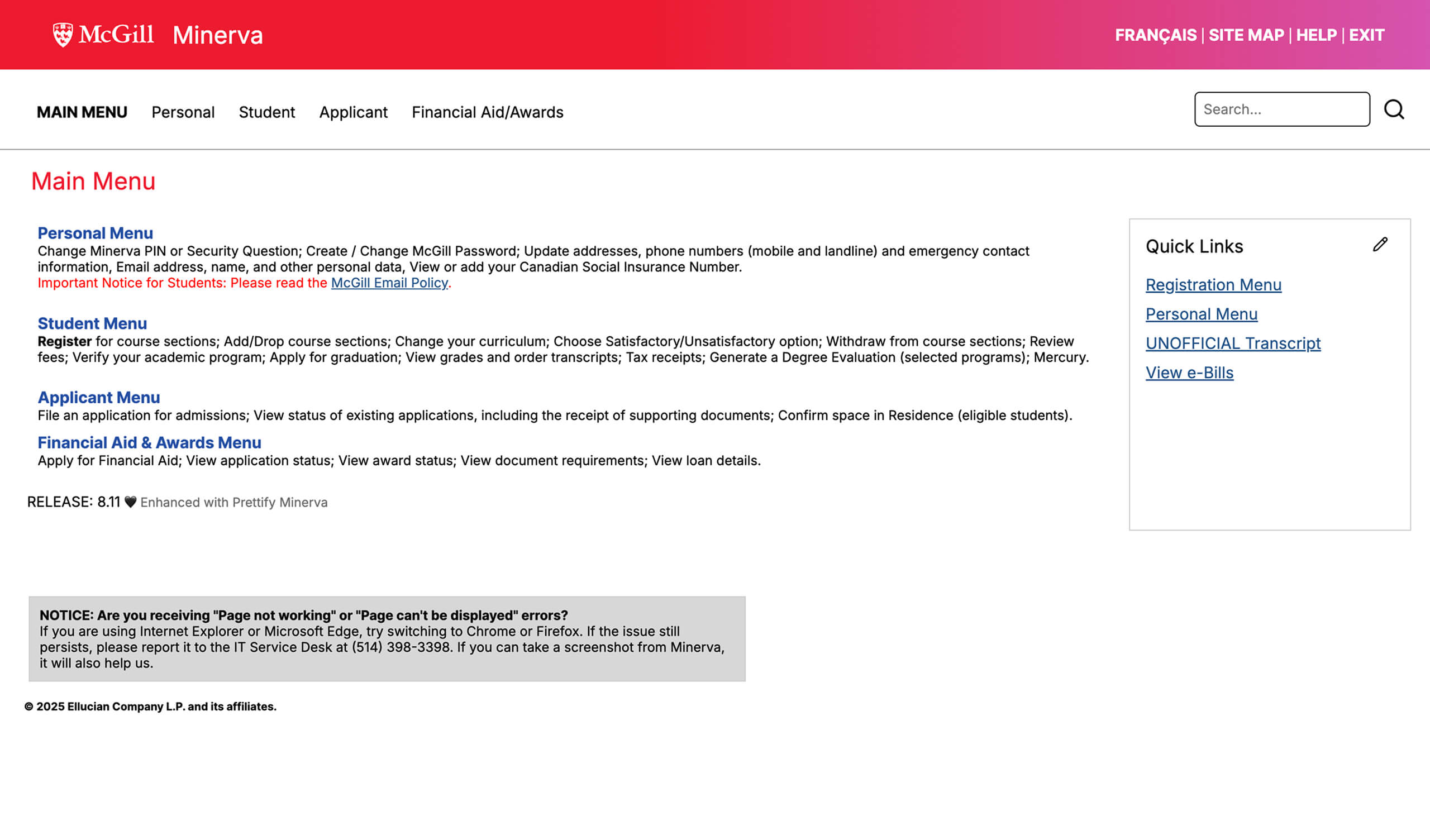
Tackling this challenge one area at a time, I started off with redesigning the top navigation bar. Rearranging HTML elements like the buttons using query selectors and adding new elements, I replaced the outdated design with a clean, modern layout.

CSS STYLING
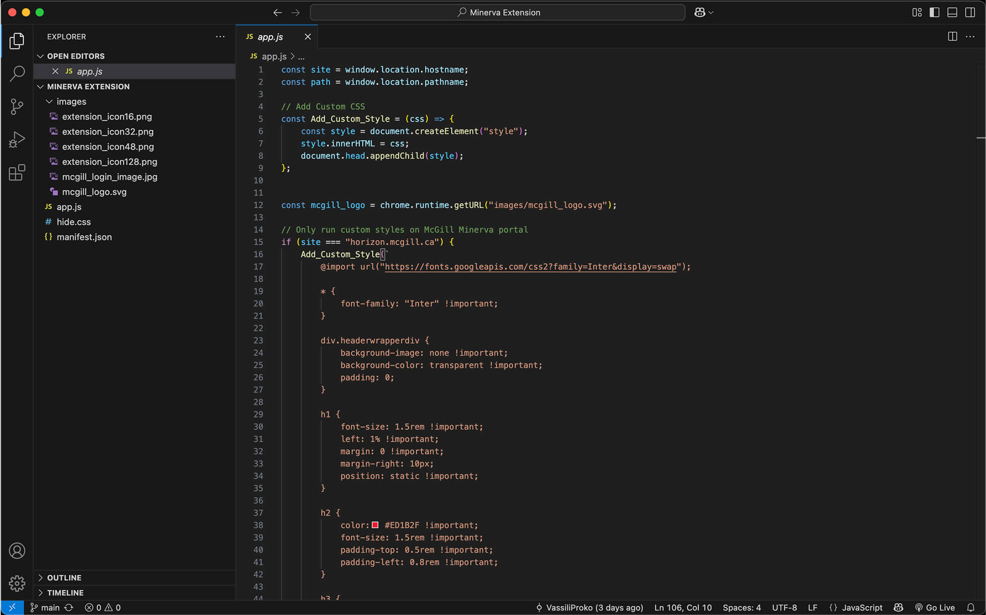
Changing the CSS styling was the quickest and best way to bring life to the site, applying site wide changes like changing the font to Inter, changing heading and table styling, and more.
QUICK LINKS
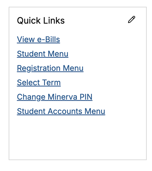
From personal experience, I found that the main menu, which displayed navigation links with descriptions, wasn’t very useful. I wanted to improve this by adding a quick links sidebar on the right side of the main page, giving users an easy way to save and access frequently visited Minerva pages.
At first, I considered including this sidebar on every page, listing all active links without descriptions. However, that idea wasn’t very effective as it reduced the main content area too much leaving some pages feeling very cramped and didn’t provide much added value for the user. I ultimately decided to add the quick links sidebar only to the main menu, where it was most helpful without disrupting the layout.
OTHER CHANGES AND ICON
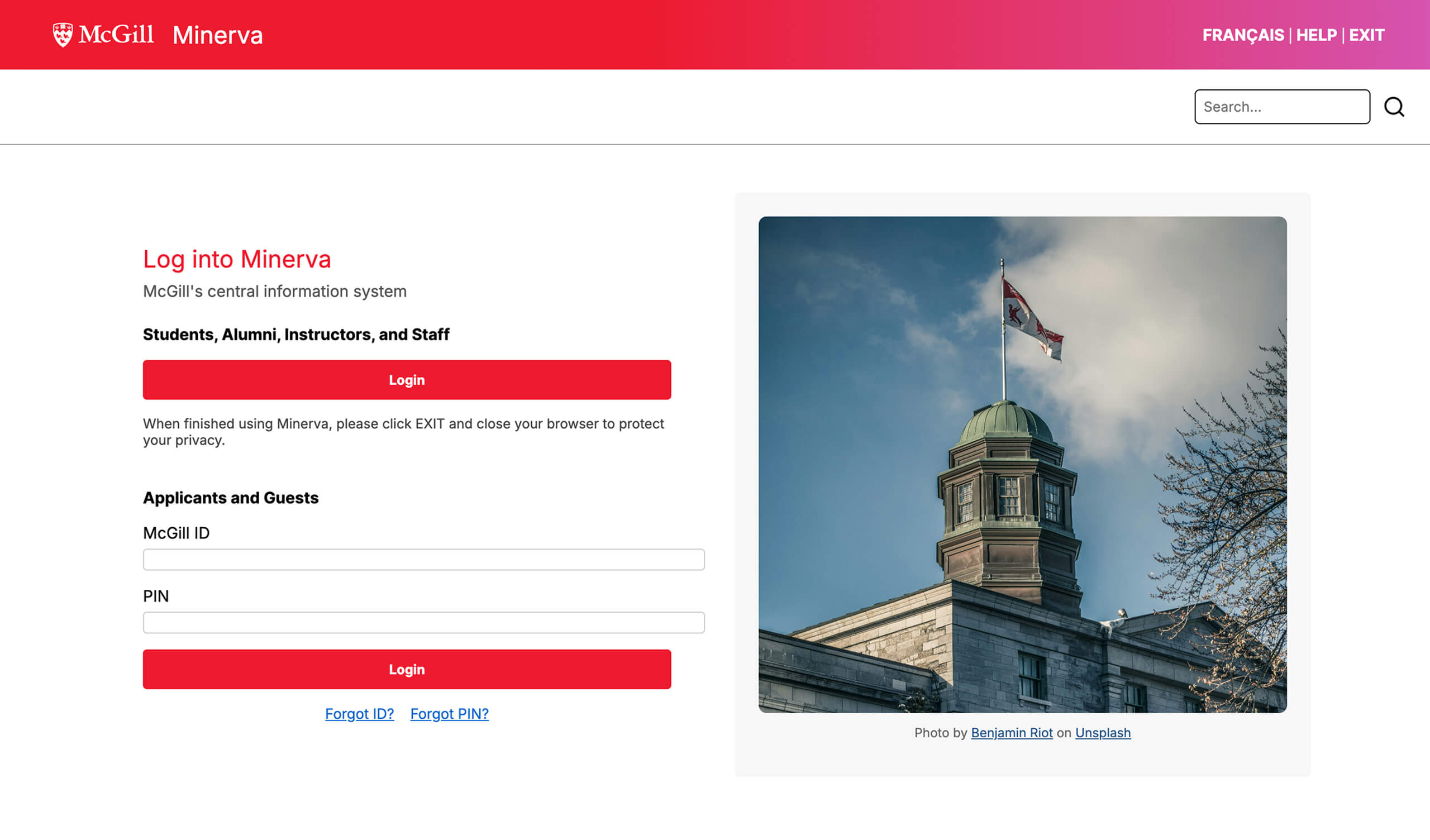
I wanted to keep the extension lightweight and avoid changing the layout of the content in pages, since most users are already familiar with Minerva’s layout. However, I did redesign the login page to make it more unique and welcoming. I used the redesign concept I created back in January as a reference and wrapped up the extension from there.
Inspired by the Made by McGill campaign font, I also designed a simple logo for the extension.
CHALLENGES
I faced a range of challenges from working around notorious DOM quirks and design constraints, to styling messy table elements, and even implementing a hide.css file to prevent users from seeing the original page before the redesigned one loaded. Despite these hurdles, I was able to develop a polished, user-friendly chrome extension.
FINAL SOLUTION
PUBLISHING
After completing development, I launched the extension on the Chrome Web Store and shared it again with online communities like the McGill subreddit, receiving great appreciation.
Open-sourcing the code on GitHub also sparked unexpected engagement with other developers forking the project and adapting it for different browsers like Firefox and Safari.
TAKEAWAYS
It was deeply rewarding to take an idea from initial design all the way through development and ultimately ship something real that others could use and build upon. I also learned a lot about front-end development with JavaScript and HTML/CSS.
“Could this be developed into a Chrome extension? This is a million times better than the current interface.” - Reddit User